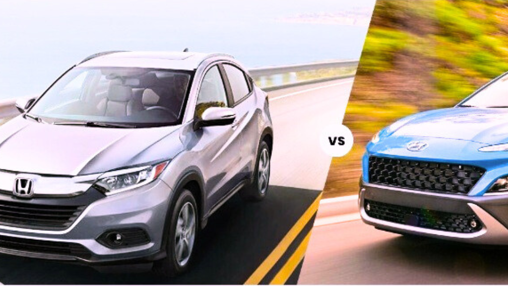
In the automotive world, a logo is more than just a design—it’s a powerful identity. Recently, the Hyundai vs Honda logo comparison has gained attention, as both brands feature a bold “H” yet carry different meanings.
With new launches and digital branding strategies, these two logos stand as iconic symbols of trust, innovation, and reliability. But what makes them different? And why do people often confuse them? Let’s explore the history, meaning, and impact of the Hyundai vs Honda logo.
Why Logos Matter in the Car Industry
Car logos are not just for looks. They shape how customers see a brand.
- Instant Recognition – A logo is the face of the brand.
- Trust & Identity – Customers often trust a brand because of its logo.
- Symbolism – Logos carry deeper meanings tied to culture and values.
- Marketing Power – A strong logo drives loyalty and helps advertising.
For Hyundai and Honda, their logos are carefully designed to reflect their values and global image.
Hyundai Logo: History and Symbolism
Origins
Founded in 1967, Hyundai needed a logo that showed modernity and global ambition. They chose a tilted “H” inside an oval.
What It Means
The Hyundai logo is more than just a letter:
- The “H” represents two people shaking hands—a customer and the company.
- The tilt shows progress and forward movement.
- The oval represents global reach.
Evolution
- Early years: A simple “HD” design.
- 1990s–today: The tilted “H” inside an oval, refined for a modern look.
- Recent updates: Slight digital adjustments to fit apps, websites, and EV branding.
Honda Logo: History and Symbolism
Origins
Founded in 1948, Honda wanted a bold, reliable symbol. The result was a strong, upright “H.”
What It Means
The Honda logo conveys:
- Strength and stability through its wide, bold lines.
- Precision and engineering excellence, with its square frame.
- A no-nonsense approach, unlike Hyundai’s symbolic handshake.
Evolution
- Early logos: Different versions for motorcycles and cars.
- 1970s–today: The iconic upright “H” inside a square or rectangle.
- Modern tweaks: Slight updates for hybrid and electric vehicles, but the core design remains timeless.
Hyundai vs Honda Logo: Key Differences
Even though both use the letter “H,” they are distinct in design and meaning.
Design Style
- Hyundai: Tilted, italicized “H” inside an oval.
- Honda: Upright, bold “H” inside a rectangle.
Symbolism
- Hyundai: Partnership, handshake, and global expansion.
- Honda: Reliability, engineering strength, and durability.
Visual Impact
- Hyundai: Sleek, modern, and customer-focused.
- Honda: Bold, timeless, and authoritative.
Why People Confuse the Hyundai vs Honda Logo
It’s easy to mistake one for the other because:
- Both are simple “H” logos.
- Both are from Asian automakers.
- Both use minimalistic styles compared to complex logos like BMW or Toyota.
However, once you spot the tilted oval of Hyundai and the rectangular bold H of Honda, the difference is clear.
Beyond Logos: Brand Identity
The Hyundai vs Honda rivalry is not just about logos—it’s also about how the brands position themselves.
Hyundai
- Affordable and stylish.
- Focus on innovation and design.
- Strong presence in the EV market.
Honda
- Known for durability and performance.
- Higher resale value.
- Trusted for engineering precision.
Logos in the Digital Age
Both companies have updated their logos for the modern world.
- Hyundai: Sleeker design for websites, apps, and electric cars.
- Honda: Maintains its bold presence but adapts for futuristic models.
Logos today must look good on a car grille, a smartphone screen, and even in virtual advertising. Both brands succeed here.
Customer Loyalty and Logo Power
A strong logo builds customer trust.
- Hyundai Logo Effect: Seen as innovative, approachable, and customer-first.
- Honda Logo Effect: Associated with strength, trust, and decades of reliability.
This is why both companies have passionate fan bases worldwide.
Hyundai vs Honda Logo: Which Stands Out More?
Both logos are effective, but they shine in different ways:
- Hyundai Logo Strengths
- Symbolic design (handshake).
- Forward-looking and modern.
- Focused on global unity.
- Honda Logo Strengths
- Bold and straightforward.
- Represents strength and trust.
- Minimal changes over decades = timeless identity.
Final Verdict
The Hyundai vs Honda logo comparison shows how two simple “H” designs can carry completely different meanings.
- Hyundai’s tilted H tells a story of partnership and progress.
- Honda’s upright H symbolizes stability and engineering excellence.
Both logos are instantly recognizable and successful in their own right. Which one resonates more often depends on what you value—innovation and customer focus (Hyundai) or strength and reliability (Honda).